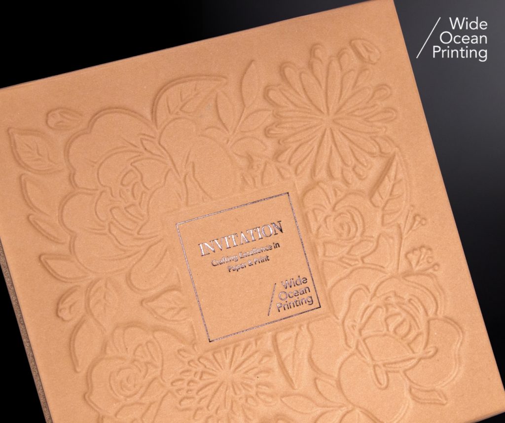
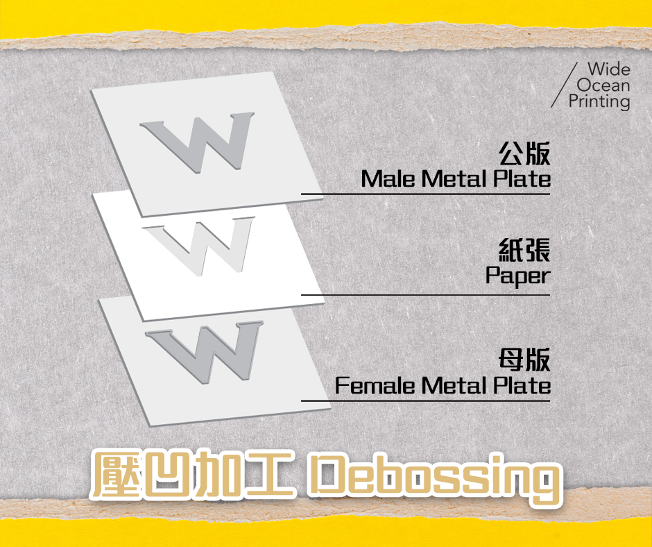
Debossing is a finishing method that presses artwork into the paper surface to create a refined, recessed effect. Widely used in packaging, stationery, book covers, and premium brand applications, it delivers a subtle yet sophisticated tactile quality. Though simple in concept, achieving a crisp deboss requires proper material selection, file preparation, and structured production.
💡FAQ 1: What paper works best?
Debossing performs best on thicker, resilient stocks (250gsm+), cotton papers, or uncoated fibrous sheets. If laminated surfaces such as matte or soft-touch films are used, compatibility testing is essential to ensure the film can withstand pressure.
💡FAQ 2: Does debossing significantly increase cost?
Since debossing requires metal dies and additional processing, it does introduce added costs. However, limiting the deboss area to brand marks or key visuals keeps budgets manageable while still enhancing impact.
💡FAQ 3: Will fine details distort under pressure?
Excessively fine lines or small text may fill in or lose clarity. Recommended artwork minimums:
- Type ≥ 8 pt
- Stroke ≥ 0.25 pt
- Negative gaps ≥ 0.4 mm
Avoid large solid areas to maintain paper stability.
✨Pro Tips ✨
🔹 Always proof first to confirm depth, clarity, and edge sharpness.
🔹 Avoid folds and die-cuts, keeping 2–3mm clearance to prevent cracking.
🔹 Pair with other finishes like foil or spot UV for layered visual appeal.
🔹 Create a dedicated “DEBOSS” layer with clear notes for die makers.
🌟Conclusion
Debossing may appear minimal, but its craftsmanship lies in the precision management of paper structure, tooling accuracy, and pressure control. When executed well, it becomes a distinctive design feature that communicates refinement and brings a memorable brand experience.
“Every design deserves the right finishing.”
Reach out to our team for
tailored recommendations, sample references, and accurate cost estimates.