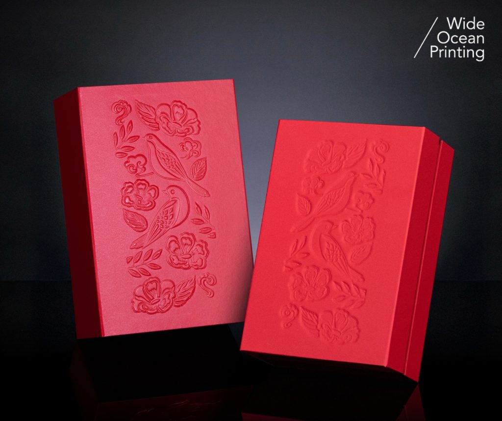
Debossing is a finishing technique that presses a design into the surface of paper, creating dimensional depth with recessed impressions and tactile details. Unlike embossing – which pushes elements outward – debossing delivers a restrained and understated visual effect. This approach is often used in luxury packaging, premium business cards, high-end stationery, book covers, and leather goods.
🔍 How Debossing Works
A metal die – typically brass or magnesium – is engraved with the desired artwork. With consistent pressure, the die pushes the design into the substrate. As no ink is involved, the final appearance depends entirely on the paper’s elasticity, the die engraving’s precision, and the press stability.
📐 Ideal Paper Choices
Debossing performs best on soft, fibrous papers such as cotton stock, uncoated art paper, or heavier specialty papers. Thin or heavily coated sheets may crack or warp during pressing. When pairing debossing with foil stamping or varnish, paper strength must also be evaluated to ensure consistency.
🛠 Artwork & File Setup
- Use vector artwork to ensure clean, sharp edges.
- Avoid overly fine lines (below 0.25pt) or very small type.
- Create a dedicated layer labeled “DEBOSS” in spot color.
- Keep at least 1.5 mm away from die-cutting lines to avoid distortion.
🔎 Quality Considerations
Successful debossing relies on even pressure and controlled paper compression. Conduct test runs to help determine ideal depth and prevent fiber damage. Inspect samples under angled light to identify uneven impressions or edge fraying.
✨ Conclusion
Debossing embodies the beauty of subtlety. Through shadows and texture—not color—it communicates refinement and premium craftsmanship. When design, materials, and production align, debossing becomes a powerful expression of brand sophistication.
“Every design deserves the right finishing.”
Reach out to our team for
tailored recommendations, sample references, and accurate cost estimates.